- Ben Haresign
- 12 Jun, 2026
- Data & Analytics
- 22 min read
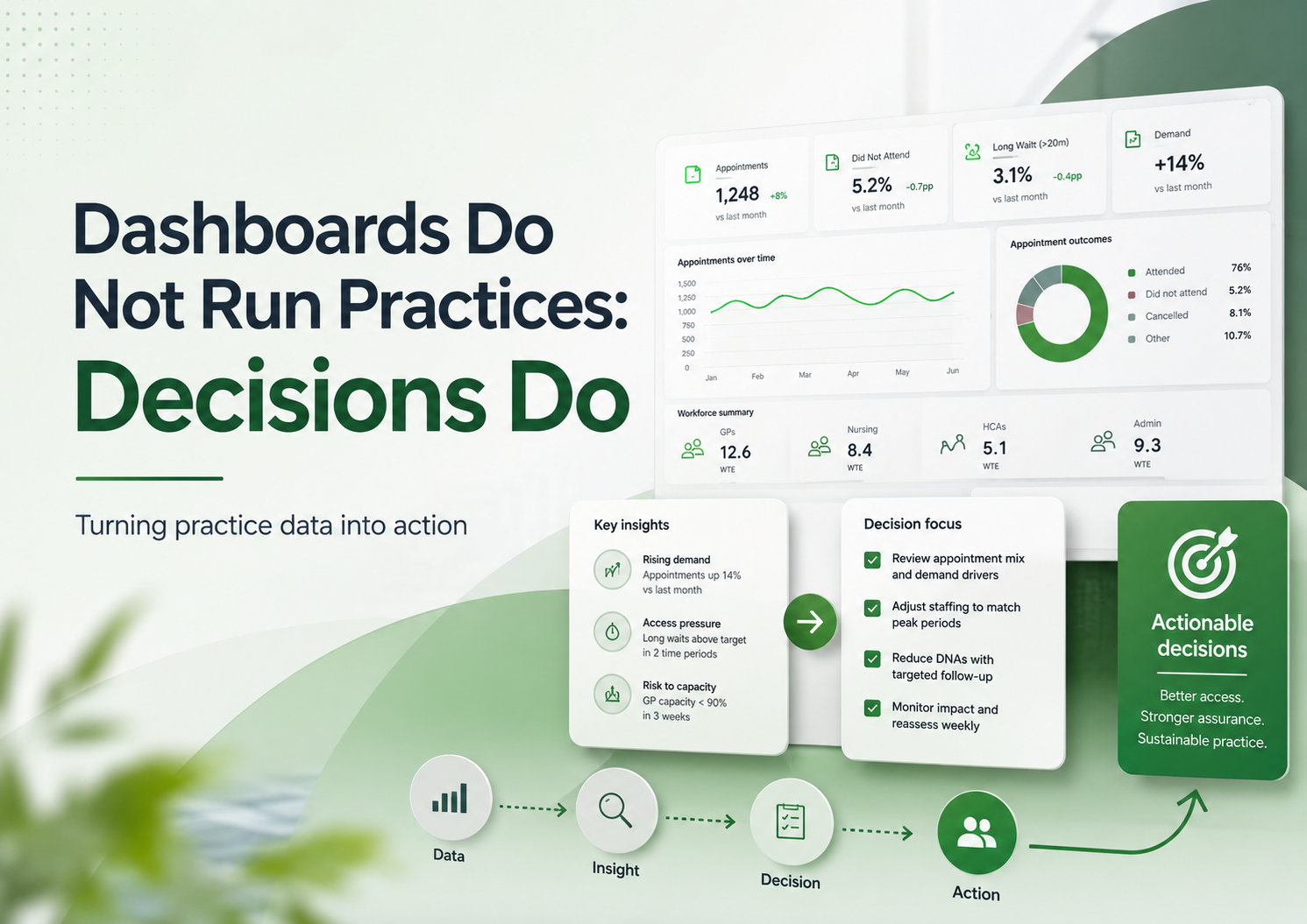
Dashboards Do Not Run Practices: Decisions Do
General practice is not short of data. It is short of time, clarity, capacity and operational headspace. A dashboard only creates value when it changes a decision, prompts an action, or helps a practice understand risk earlier.
This guide looks at how practices can move from passive reporting to practical management intelligence: data that supports action, assurance, income protection, access planning, workforce sustainability and safer day-to-day operations.
Core message
A dashboard is not the management plan. It is only useful if it helps the practice decide what happens next.
Does this data change a decision, trigger an action, evidence assurance, or reduce risk?
Data has become part of everyday general practice management. Most practices now have access to more reporting than ever before: appointment dashboards, QOF trackers, call statistics, workforce submissions, prescribing searches, CQC evidence logs, finance reports, access data, PCN activity, claims monitoring and patient survey results.
On paper, this should make management easier. In reality, many practices are drowning in reports while still struggling to answer the most important question:
What are we going to do differently because of this information?
That is the difference between a dashboard and management intelligence.
A dashboard shows information. Management intelligence changes a decision.
This distinction matters because general practice is not short of data. It is short of time, capacity, clarity and headspace. A dashboard that does not lead to action can become another thing to maintain, another thing to explain, another thing to look at briefly before returning to the real operational pressure of the day.
Dashboards do not run practices. Decisions do.
The problem with dashboard culture
There is a familiar pattern in many organisations, not just general practice.
A problem appears
Something feels difficult, risky, delayed or unclear.
Someone asks for a report
The instinct is to measure the issue before defining the decision.
A dashboard is created
Everyone agrees it looks useful and reassuring.
Nothing changes
The issue is now visible, but not necessarily managed.
This is not because dashboards are bad. Good dashboards can be incredibly useful. The problem is when the creation of the dashboard is treated as the solution.
In general practice, this risk is particularly high because the environment is already packed with reporting requirements. Practices are expected to understand demand, capacity, contract delivery, finance, workforce, complaints, significant events, safeguarding, prescribing, QOF, enhanced services, patient experience and regulatory compliance.
That creates a temptation to keep building more reports. But more reports do not automatically create more control.
The risk
A practice can have a beautifully designed dashboard and still have no clear owner, no threshold for action, no meeting route, no risk escalation and no follow-up. That is when data becomes decorative.
Useful, interesting, sometimes impressive — but not operationally powerful.
A dashboard should not be the end product. It should be the start of a decision.
Data should answer a management question
The first test of any dashboard is simple:
What question is this trying to answer?
If that question is not clear, the dashboard will usually become either too broad, too detailed or too vague.
General practice data is only useful when it is connected to a management question that matters.
For example, “How many appointments did we offer?” is a valid question, but on its own it rarely helps a practice make a decision. A better question might be:
Is our appointment capacity aligned with actual patient demand, workforce availability and safe working limits?
That question immediately changes the way the data is used. It encourages the practice to look not just at appointment numbers, but at appointment type, demand by time of day, clinician mix, unused slots, same-day pressure, continuity, follow-up burden and avoidable rework.
| Area | Passive reporting question | Better management question |
|---|---|---|
| QOF | What is our achievement? | Which indicators are at risk, what is recoverable, and who owns the action? |
| Appointments | How many slots did we offer? | Is capacity matching demand safely and sustainably? |
| Telephony | How many calls did we receive? | When are patients struggling to get through, and what operational change would reduce avoidable pressure? |
| Workforce | How many staff do we have? | Does our workforce trend support reimbursement, resilience and future planning? |
| Finance | What income have we received? | Are we claiming correctly, forecasting realistically and protecting cashflow? |
| CQC | Do we have evidence? | Can we show live oversight, accountability and learning? |
| Patient experience | What did the survey say? | Which issues are within our control and what will we change in the next 12 months? |
| Prescribing | How many patients are on a drug? | Which patients need review, monitoring or escalation? |
The better the question, the more useful the dashboard.
A weak question produces a weak report. A strong question creates management intelligence.
The trap of “interesting” data
One of the biggest problems with dashboards is that they can become full of information that is interesting but not actionable.
Interesting data has value, but it can also distract. A chart may show that demand is higher on a Monday. That is interesting. But if the practice already knows Mondays are difficult and has no capacity to change staffing, access routes or appointment configuration, then the chart alone does not move the practice forward.
The useful follow-up question
What can we do with this information?
- Can we adjust duty doctor sessions?
- Can we change online consultation availability?
- Can we move routine admin away from peak access periods?
- Can we communicate differently with patients?
- Can we identify avoidable repeat contact?
- Can we change internal triage flows?
- Can we use care navigation more effectively?
- Can we protect clinical time from preventable interruptions?
If the answer is no, the data may still be worth knowing, but it should not dominate the management agenda.
Every data point should earn its place. A useful test is:
If not, it may not belong on the main dashboard.
In general practice, attention is a limited resource. Dashboards should protect that attention, not consume it.
Dashboards need ownership
A dashboard without ownership is just a noticeboard.
It may display the right information, but nobody is responsible for doing anything with it. This is one of the most common reasons dashboards fail. The report is technically accurate, visually clear and regularly updated, but it does not belong to anyone operationally.
| Dashboard area | Possible owner | Responsibility |
|---|---|---|
| QOF performance | QOF lead / Practice Manager | Monitor risk, allocate searches, review recovery plan. |
| Access data | Operations lead | Identify pressure points, review capacity and demand. |
| Workforce trend | Practice Manager / Business Manager | Check workforce submissions, reimbursement and sustainability. |
| CQC evidence | Compliance lead | Maintain live evidence and action logs. |
| Claims | Finance lead | Confirm income has been claimed, received and reconciled. |
| Prescribing safety | Clinical pharmacist / GP lead | Review monitoring gaps and escalation. |
| Complaints and feedback | Governance lead | Identify themes, learning and communication changes. |
Monitoring is not the same as managing
Without ownership, dashboards can create a false sense of assurance. Everyone has seen the number, but nobody has acted on it.
Every dashboard needs thresholds
A useful dashboard should help the practice understand when action is required. That means defining thresholds.
Not every amber or red status needs to trigger panic. General practice has enough artificial urgency already. But the practice should agree what different levels of concern mean.
| Status | Meaning | Action |
|---|---|---|
| Green | Within expected range | Continue routine monitoring. |
| Amber | Early concern or emerging trend | Review at next operational meeting. |
| Red | Material risk or worsening trend | Allocate owner and action. |
| Critical | Immediate operational, financial or safety concern | Escalate to partners / leadership team. |
The important point is not the colour itself. It is the agreed response.
The practice should know
- What counts as normal variation?
- What counts as an early warning?
- What needs immediate action?
- Who is responsible for reviewing it?
The practice should record
- Where the decision was made.
- Who owns the follow-up.
- When the issue will be reviewed again.
- Whether the risk has changed.
A red indicator that appears every month without action is not a warning system. It is wallpaper with anxiety attached.
The three-layer model for practice intelligence
One way to make dashboards more useful is to separate information into three layers. Each layer answers a different type of question.
Operational intelligence
What needs doing now? This supports the week in front of the practice.
Management intelligence
What trend needs intervention? This supports oversight, prioritisation and risk management.
Strategic intelligence
What does this mean for the future? This supports partners, sustainability and business planning.
1. Operational intelligence: what needs doing now?
Operational intelligence is about immediate action. This is the information that helps the practice manage the week in front of it.
- Which QOF searches need action this week?
- Which high-risk drug monitoring reviews are overdue?
- Which patients need follow-up?
- Which claims need submitting?
- Which staff checks are expiring?
- Which appointment sessions are under pressure?
- Which documents need review?
- Which tasks are breaching internal timescales?
This layer should be practical, specific and owned. It does not need to be beautiful. It needs to be usable.
2. Management intelligence: what trend needs intervention?
Management intelligence looks beyond individual tasks and asks whether the system is working. This is usually the layer most useful to practice managers, business managers, partners and operational leads.
It should help ask
- Is demand increasing faster than capacity?
- Are we relying too heavily on certain staff?
- Is our appointment model creating avoidable rework?
- Are we delivering contract activity at the right pace?
- Are claims being submitted and reconciled?
It should help decide
- What needs attention?
- What needs escalation?
- What can be stopped?
- What should be prioritised?
- What is becoming unsustainable?
This is where dashboards become genuinely powerful. Not because they show numbers, but because they help leaders make better decisions earlier.
3. Strategic intelligence: what does this mean for the future?
Strategic intelligence is about direction. This is the layer that supports partner discussions, business planning, workforce modelling, investment decisions and sustainability.
Strategic intelligence asks:
- Is our current operating model sustainable?
- Are we investing in the right roles?
- Are we claiming income effectively?
- Are we using enhanced services profitably and safely?
- Are we building resilience or simply absorbing more pressure?
- Are there risks to partner drawings, staffing, premises, access or compliance?
- Are we making decisions based on evidence or instinct?
- Where should the practice be in 12 months?
This layer should not be overloaded with daily operational noise. It should provide enough evidence to support strategic choices.
If the practice is considering investing in a new role, the decision should not be based only on whether the role sounds useful. The practice should consider what problem the role solves, what income supports it, what supervision is needed, what work will be released, what risk will be reduced and how success will be measured.
Strategic intelligence joins data to judgement.
A dashboard should connect to meetings
If a dashboard does not connect to a meeting structure, it often becomes detached from decision-making.
This is a simple but important point: data needs somewhere to go.
| Meeting | Dashboard focus |
|---|---|
| Daily huddle | Immediate operational pressure, staffing, urgent risks. |
| Weekly operations meeting | Access, workload, tasks, claims and staffing issues. |
| Monthly management meeting | QOF, finance, workforce, complaints, CQC and risk register. |
| Partner meeting | Strategic risk, investment, sustainability and contract delivery. |
| Clinical governance meeting | Safety, prescribing, significant events, audits and learning. |
| CQC readiness review | Evidence, action logs, leadership oversight and staff confidence. |
The full loop
Data → Review → Decision → Action → Owner → Follow-up → Evidence
That is where the value sits.
Data should reduce risk, not just describe it
A common issue in practice management is that data describes risk after it has already become obvious.
- QOF income is at risk near year end.
- Staff compliance is incomplete before inspection.
- Call waits are poor after complaints increase.
- Claims have not been submitted after income is missing.
- Workforce data is questioned after reimbursement does not match expectations.
- Prescribing monitoring is reviewed after a safety concern.
- Patient feedback is reviewed after confidence has already dropped.
- Policy gaps are found only when evidence is requested.
The aim should be to use data earlier. Dashboards should help the practice spot emerging risk before it becomes a crisis.
A good dashboard should include forward-looking measures, not just backward-looking ones.
Example: useful QOF risk intelligence
The question becomes: what is realistically recoverable, and what do we need to do now?
The difference between reporting and assurance
This is especially important for CQC readiness.
Many practices treat CQC evidence as a folder, a shared drive or a collection of documents. But evidence alone is not assurance.
Reporting shows
- That a document exists.
- That a number has been collected.
- That a tracker has been updated.
- That a meeting happened.
Assurance shows
- Who reviewed the information.
- What the practice understood from it.
- What action was taken.
- How partners know risk is being managed.
A staff training tracker is not assurance by itself. It becomes assurance when the practice can show who monitors it, how often it is reviewed, what the current gaps are, what action has been taken, what risks have been escalated, how new starters are added, and how overdue training is followed up.
The better question is: how does the practice use this information to maintain safe, effective and well-led services?
QOF dashboards need to show recoverability
QOF is a good example of where dashboards can be both helpful and misleading.
A simple QOF dashboard might show points achieved, prevalence, income and year-to-date performance. That is useful, but it may not be enough to support decision-making.
The more important question is often:
What is recoverable?
Not every underperforming indicator is equal. Some may need simple admin work. Some may need coding review. Some may need patient invitations. Some may require clinical judgement. Some may be affected by capacity. Some may no longer be realistically recoverable before year end.
| QOF position | Management response |
|---|---|
| Low effort, high value | Prioritise quickly. |
| High clinical importance | Allocate clinical review. |
| High value but capacity-dependent | Discuss staffing and timing. |
| Low value and high workload | Consider proportionality. |
| Not realistically recoverable | Document rationale and avoid wasted effort. |
| Coding uncertainty | Review searches and coding processes. |
Good QOF intelligence helps practices avoid two common mistakes: ignoring risk until it is too late, and chasing activity that is no longer proportionate.
The goal is not just achievement. The goal is intelligent, clinically appropriate, financially aware delivery.
Access dashboards need context
Access data is another area where dashboards can mislead if used badly.
Appointment numbers alone do not tell the full story. A practice may offer a large number of appointments but still have poor patient experience. Another practice may offer fewer appointments but manage demand more effectively through continuity, care navigation, digital triage, pharmacy pathways or better follow-up planning.
Capacity
- Total appointment capacity
- Same-day vs pre-bookable split
- Clinician type
- Session utilisation
Demand
- Telephone demand
- Online consultation demand
- Peak contact times
- Seasonal variation
Experience
- DNA rates
- Follow-up rates
- Patient feedback themes
- Continuity impact
Is our access model safe, understandable, sustainable and aligned with patient need?
If call data shows extreme pressure between 8:00 and 9:30, the answer may not be to simply add more call handlers. The practice may need to understand why patients are calling at that time, what alternatives exist, whether online routes are creating duplication, whether prescriptions and results queries are entering the wrong channel, and whether appointment release patterns are driving avoidable contact.
Workforce dashboards need to link to sustainability
Workforce data is often treated as a submission requirement, especially where national reporting or reimbursement is involved. That is a missed opportunity.
Workforce intelligence should help practices understand resilience, risk and sustainability.
Useful workforce questions
- Are we dependent on one or two key individuals?
- Are staff working beyond safe or sustainable levels?
- Are we using roles in the way they were intended?
- Are we claiming reimbursement correctly?
- Are workforce changes reflected accurately in reporting?
- Are we seeing gaps in supervision?
- Are absences affecting service delivery?
- Are we investing in the right roles?
- Do our workforce trends match our access model?
- Are we building capacity or just moving pressure around?
A practice may appear well staffed on paper but still be fragile because key roles are part-time, clinical supervision is limited, new roles are not embedded, admin workload has increased, demand has shifted, or partners are absorbing hidden work.
In general practice, whole-time equivalent is not the same as resilience.
Finance dashboards need to support decisions, not just totals
Finance reporting is another area where dashboards can easily become too passive.
A monthly income report is useful, but the management question is usually more specific.
- What income are we expecting?
- What has been claimed?
- What has been received?
- What is missing?
- What is at risk?
- What is non-recurrent?
- What depends on activity?
- What depends on coding?
- What is the cashflow impact?
- What is the workload cost of earning it?
This is particularly important for enhanced services, QOF, reimbursement schemes and locally commissioned services. Practices need to understand not only what income is available, but whether it is achievable and whether it is worth the operational effort.
It is: what income is realistically achievable, what work is required to secure it, and what risk sits behind the number?
Patient experience dashboards need to lead to visible change
Patient survey data can be difficult for practices. The feedback is often important, but it can feel broad, frustrating or disconnected from the reality of daily operational pressure.
A dashboard may show patient satisfaction, access scores, call experience, appointment availability, confidence in clinicians or overall experience. But the real question is:
What are we going to change that patients will actually notice?
Patient experience data should not sit in isolation. It needs to be connected to access, communication, staffing, demand, complaints and operational design.
| Patient experience intelligence should separate | Why it matters |
|---|---|
| What patients are telling us | Captures the lived experience of the service. |
| What the operational data shows | Tests whether the feedback matches measurable pressure points. |
| What is within our control | Keeps improvement work realistic and honest. |
| What is constrained by wider system pressure | Avoids blaming the practice for issues it cannot solve alone. |
| What we will change | Turns feedback into visible action. |
| How we will measure whether it worked | Completes the improvement loop. |
The danger of false precision
Dashboards can make numbers look more certain than they really are.
This is a particular risk when data comes from multiple systems, inconsistent coding, manual uploads, old searches, national publications or local spreadsheets.
Precision is not the same as accuracy
A number with two decimal places can still be wrong. A confident but wrong dashboard can cause real operational, financial or assurance problems.
- Where does the data come from?
- How often is it updated?
- Is it complete?
- Is it coded consistently?
- Does it include all relevant patients?
- Are there known exclusions?
- Has the search logic been reviewed?
- Has the data been sense-checked?
- Is the trend real or caused by a reporting change?
- Is it showing activity, outcome, workload or risk?
Keep dashboards close to the work
The most useful dashboards are usually built close to the people who understand the work.
That does not mean every practice needs advanced analytics skills. It means the dashboard should be designed with the people who will use it. A report built in isolation can miss the operational reality.
A dashboard may show overdue monitoring, but staff may know that some patients are housebound, some are under secondary care, some have declined, some need coding correction and some are already booked.
A dashboard may show appointment pressure, but reception staff may know that a large proportion of calls relate to test results, hospital letters, prescription queries or confusion about online forms.
Ask the people closest to the process
- Does this reflect reality?
- Is anything missing?
- Is anything misleading?
- What would help you act on this?
- What decision should this support?
- What would make this easier to use?
The best dashboards are not just technically correct. They are operationally useful.
Make the action visible
One of the simplest ways to improve dashboard use is to add an action section.
Many dashboards show the issue but not the response.
| Issue | Evidence | Risk | Owner | Action | Review |
|---|---|---|---|---|---|
| QOF indicator below expected trajectory | Current achievement and patients remaining | Income and clinical review risk | QOF lead | Run searches and allocate recalls | Next QOF review |
| Call waits high on Mondays | Telephony trend | Patient experience and complaints | Operations lead | Review staffing and appointment release pattern | Ops meeting |
| Mandatory training gaps | Staff tracker | CQC and safety risk | Compliance lead | Contact staff and escalate overdue items | Compliance review |
| Enhanced service claims outstanding | Claims tracker | Income loss | Finance lead | Submit and reconcile claims | Finance review |
This turns the dashboard into a management tool. It also creates an audit trail for internal assurance, partner oversight, CQC readiness and continuity when staff change.
Do not confuse measurement with improvement
Measuring something does not automatically improve it.
A practice can measure call waits every day and still not improve access. It can track QOF every week and still miss indicators. It can monitor complaints and still fail to change communication. It can record training gaps and still not complete training.
Identify the issue
What is the data telling us?
Understand the cause
Why is this happening?
Agree the action
What will change?
Review the impact
Did it work?
Dashboards mainly support identifying the issue and reviewing the impact. They do not replace the work in the middle. That is where management, leadership and operational discipline come in.
Build fewer dashboards, but make them matter
Practices do not need endless dashboards. They need a small number of useful views that support real decisions.
Each dashboard should have a purpose, owner, review cycle and action route. If it does not, it probably needs redesigning or retiring.
What good looks like
Clear
It is obvious what the dashboard is showing and why it matters.
Focused
It highlights information that supports decisions, not everything available.
Timely
The data is updated often enough to be useful.
Owned
Someone is responsible for reviewing, explaining and escalating issues.
Actionable
It leads to decisions, actions or assurance.
Honest
Limitations, assumptions and data quality issues are clear.
A dashboard is not successful because it exists. It is successful because it helps the practice run better.
Questions every practice should ask about its dashboards
- Who is this for?
- What decision does it support?
- How often is it reviewed?
- Who owns it?
- What action does it trigger?
- What threshold requires escalation?
- Where are decisions recorded?
- Is the data accurate enough?
- Is anything missing?
- Is anything shown that nobody uses?
- Does this reduce risk?
- Does this save time or create more work?
- Would the practice notice if this dashboard disappeared?
From dashboard to operating model
The best practices do not just have dashboards. They have an operating model around the dashboards.
Review rhythm
The practice knows what information is reviewed and when.
Clear ownership
The practice knows who reviews, explains and escalates each area.
Action tracking
The practice records decisions, actions, owners and follow-up dates.
Risk connection
Emerging risks move into the risk register or partner discussion when needed.
Assurance route
Partners and managers can see how issues are being monitored and managed.
Improvement loop
The practice can measure whether changes have actually made a difference.
This is the difference between having data and having grip.
A dashboard can support that model, but it cannot create it by itself. The practice still needs leadership routines, clear accountability and disciplined follow-up.
The role of judgement
No dashboard can replace judgement. This is especially true in general practice, where data rarely tells the whole story.
Numbers need context. A sudden change in demand might reflect flu, local media coverage, school holidays, hospital delays, staff sickness or a change in appointment release. A dip in QOF performance might reflect coding, clinical capacity, patient choice or search logic. A workforce trend might reflect genuine staffing change or simply inaccurate submission data.
The dashboard can point to the issue
It cannot fully explain it. Good managers use dashboards as evidence, then apply judgement.
The skill is knowing when to trust the data, when to question it, and when to look deeper.
That is not a technical skill alone. It is an operational leadership skill.
Useful Haresign tools
Management intelligence works best when practices can quickly turn raw data into clearer questions, better evidence and practical decisions. These tools can help support that process.
Conclusion: the dashboard is not the decision
Dashboards can be powerful tools for general practice.
They can help practices understand risk, monitor delivery, protect income, improve access, support CQC readiness, plan workforce and respond to patient experience.
But only if they are used properly.
A dashboard that does not change a decision
is just a display.
A dashboard that does not trigger action
is just a report.
A dashboard that nobody owns
is just background noise.
The real value comes when data is connected to questions, ownership, thresholds, meetings, actions and follow-up.
That is when reporting becomes management intelligence.
General practice does not need more digital wallpaper.
It needs clearer decisions, earlier warnings, better assurance and practical action.
Dashboards do not run practices. Decisions do.